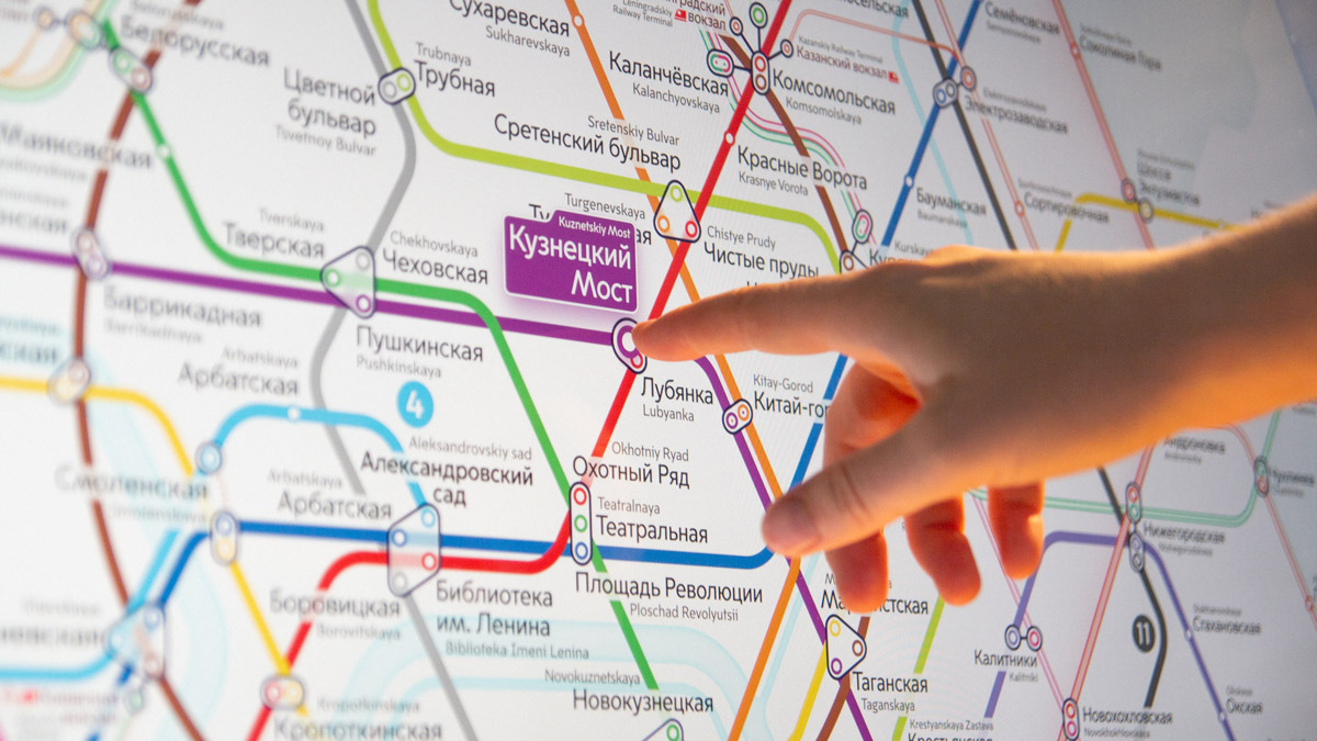
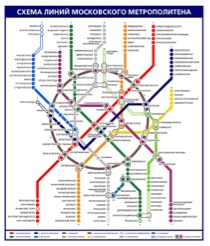
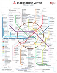
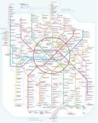
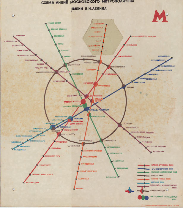
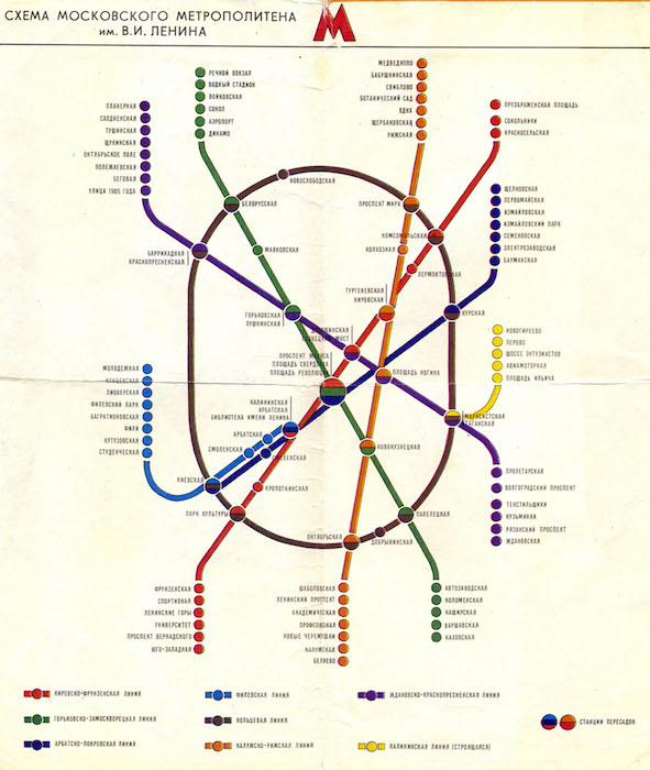
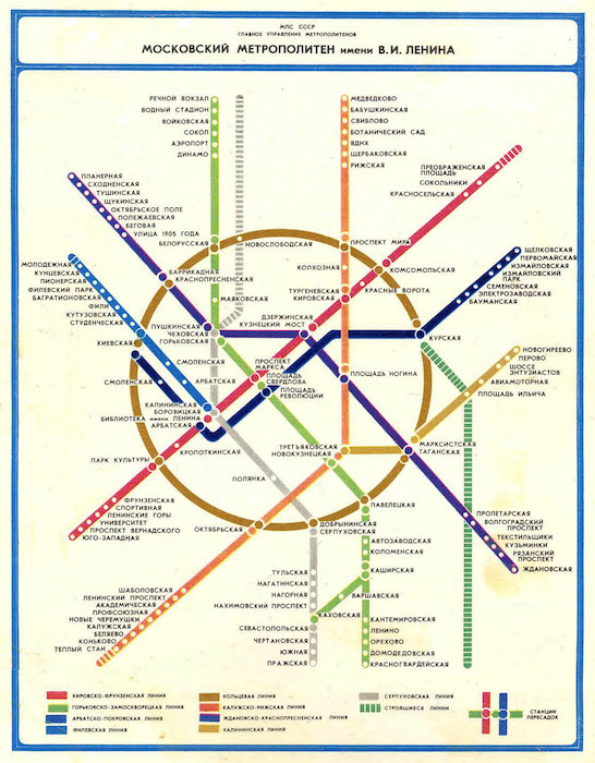
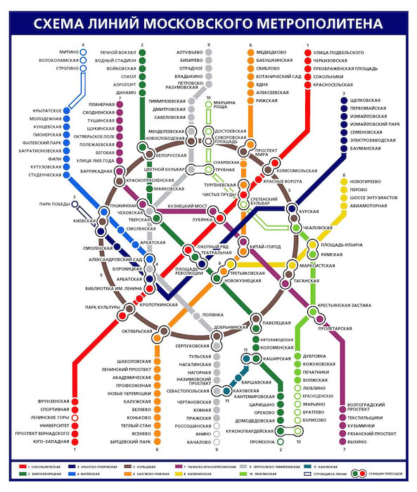
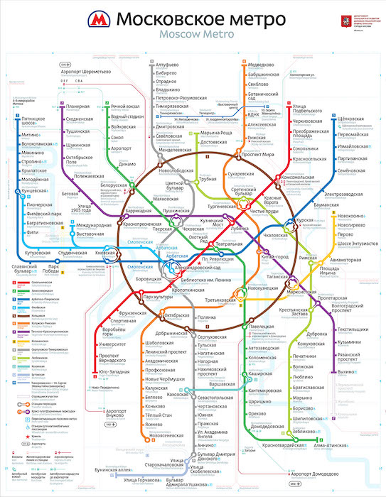
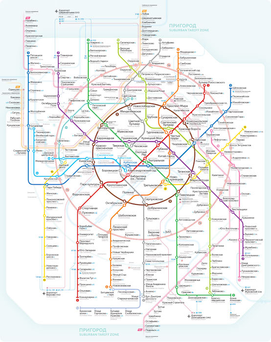
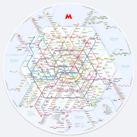
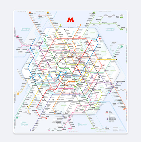
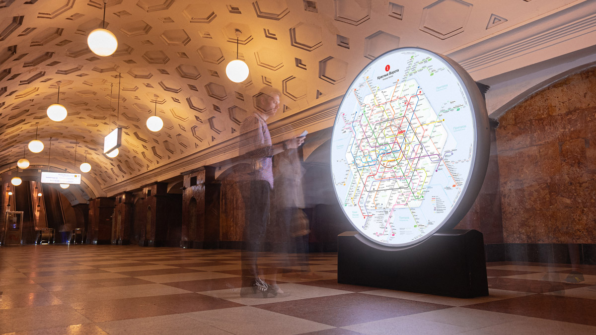
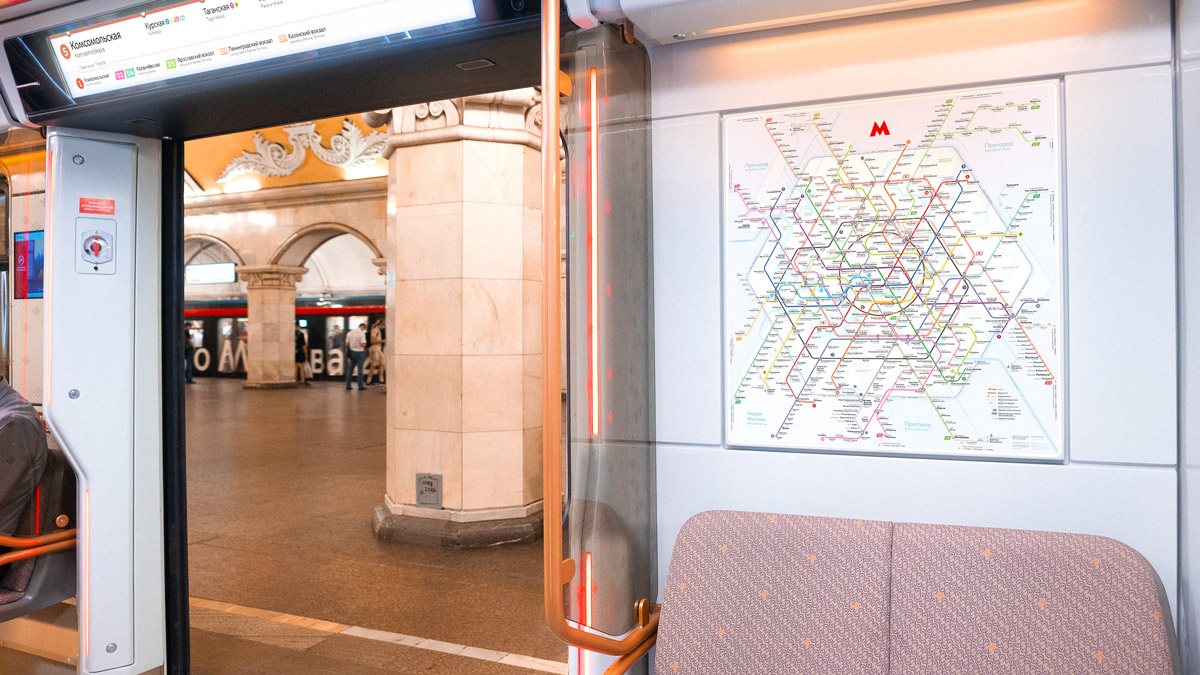
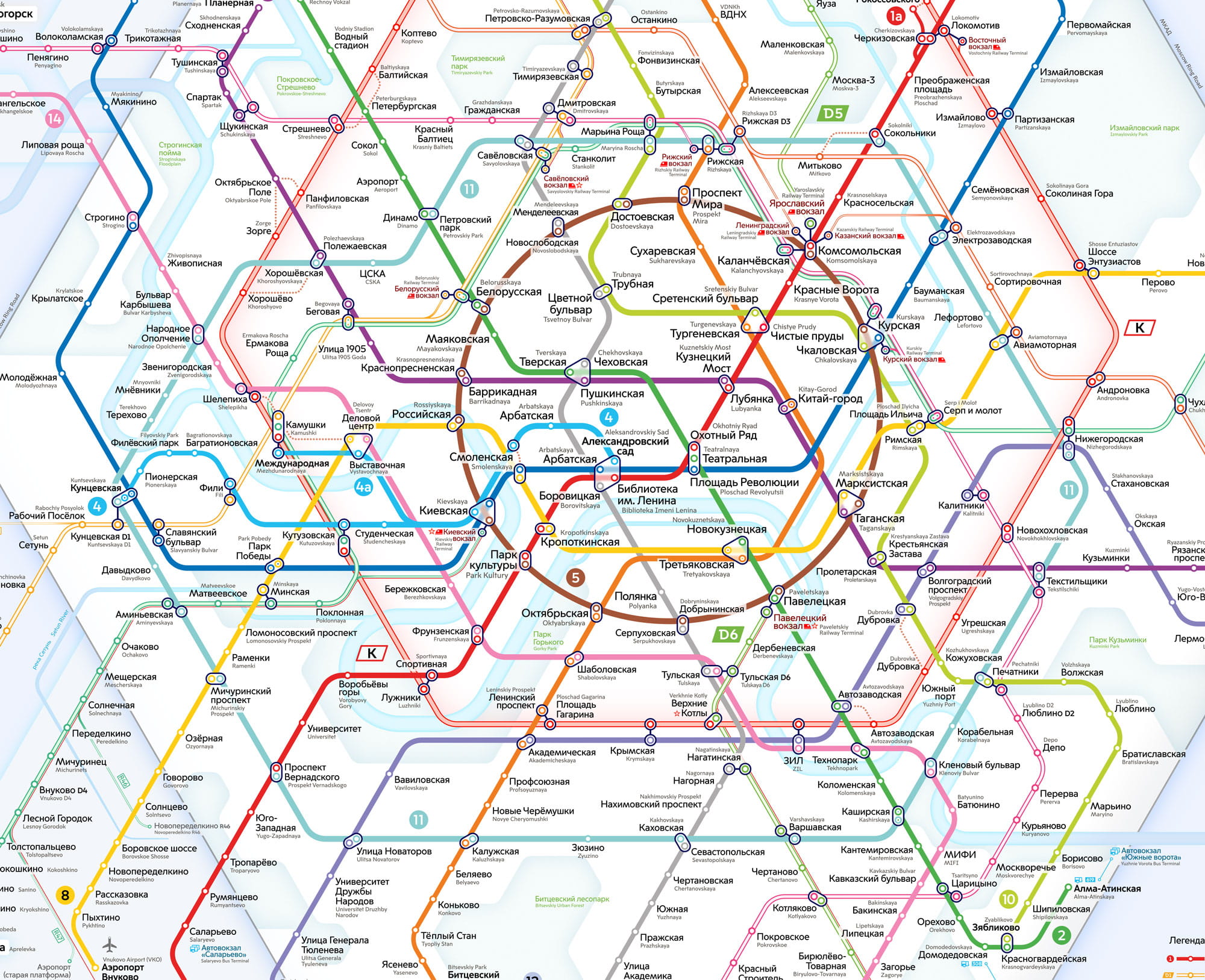
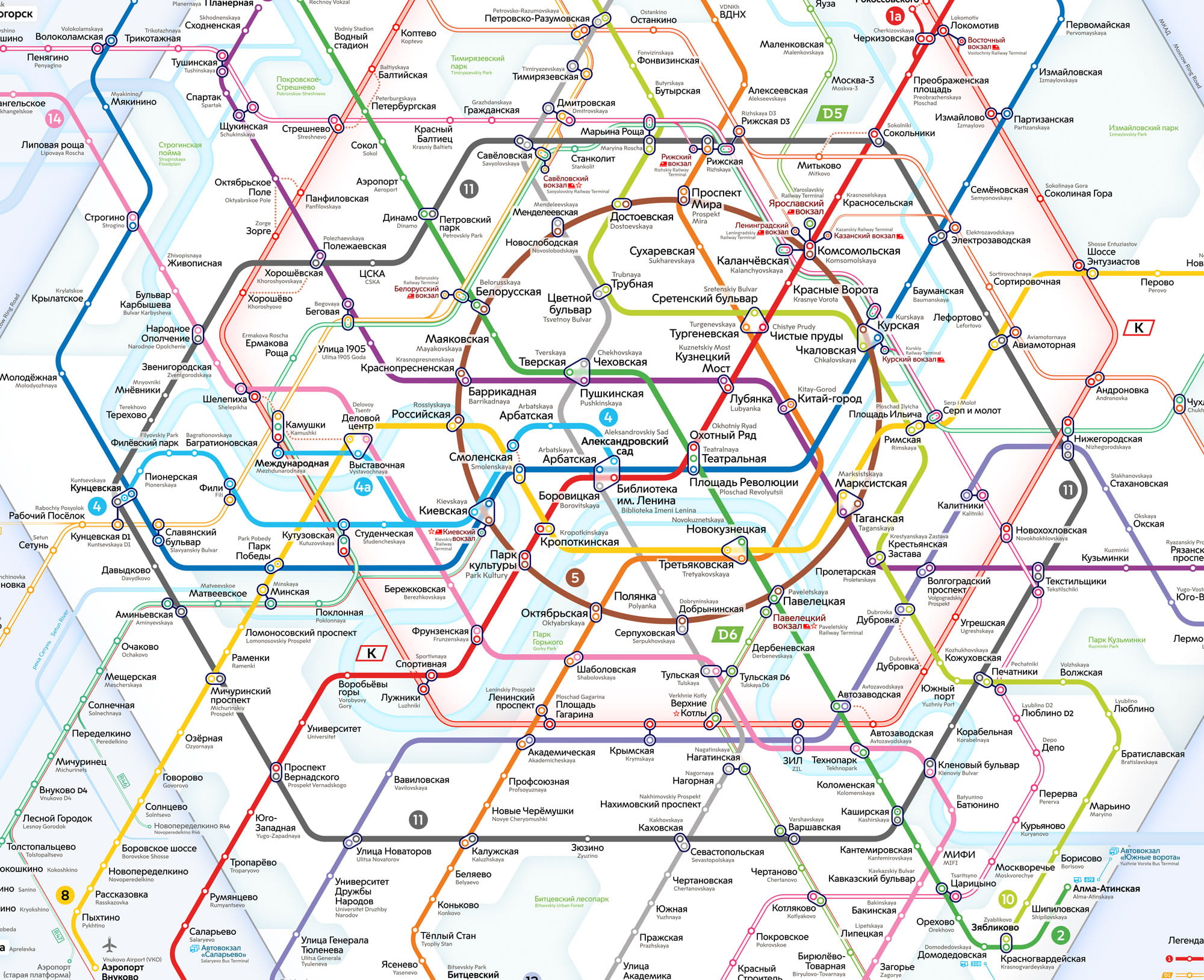
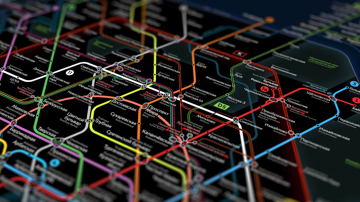
Moscow Metro map 2030
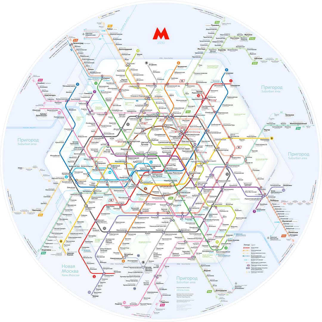
We designed a brand-new map of the Moscow Metro. It shows what the transport system will be like in ten years.
Three new diameters
![]()
![]()
![]() ,
and two new radial lines
,
and two new radial lines
![]()
![]() will be built, and the Big Circle line
will be built, and the Big Circle line ![]() will become a complete circle.
will become a complete circle.